
This post discusses how people connect dots (sometimes literally) to paint pictures of the law or processes related to it to make complex data appear simple.
Moving from very general to extremely specific, first, there are two political visualizations. One is a chart of the political history of the U.S. Congress, followed by a dynamic visualization of U.S. Senate voting patterns over the past several years.
The next segment looks at ways to look at laws resulting from those politics with two different flow charts. One is a decision tree for evaluating hearsay exceptions, the other is a semantic directed graph that traces how to determine what kind of metaphorical shoes someone is wearing in a Medicare-related regulatory scheme. Yes, you read that correctly: There are actually Medicare regulations about not just one, but two different kinds of metaphorical shoes (details and links below).
Finally, there is a link to a survey about legal research systems. That might seem out of place at first, but one idea behind the survey is to figure out what people want to do with certain kinds legal data, specifically, how they can access the data in a way that allows them to better draw a mental or literal picture of the law, like the charts shown here. If there are enough responses to likely support statistical significance, there is a plan to publish the survey results. So, if this is something that interests you or your colleagues, please participate in the survey and ask your friends and colleagues to participate too.
Without further ado, on to the
pictures.
Politics
If there was every any doubt that politics are the lifeblood of our representative democracy (or the atherosclerotic plaque slowing it to a halt), this vascular-looking chart should dispell those doubts. The picture itself describes this in more detail, but each color and the width of each color band show how many members of Congress in major parties fell/fall within certain zones of the political spectrum. At a glance, you can see the political effects (or sometimes causes) of external events. What is particularly striking to me is how the political climate seems to generally correlate to events such as economic downturns (Democrats gain seats) or wars (Republicans gain seats), or when you have both a war and an economic downturn (both parties tend to get more extreme).
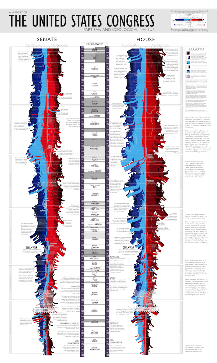
(Click here to see the chart at xkcd.com; once there, click on it for a full-size picture--it's huge and requires a lot of scrolling, but it’s worth it.)
Another fun political visualization is from Chris
Wilson at Yahoo, (via Rob Richards; Thanks, Rob!) which looks at voting networks in the U.S. Senate.
As an aside, for people who are interested in how technology can help make law more accessible and understandable and don’t follow Rob on Twitter or Google Plus (or both), you are missing out in a big way. Rob curates a steady and consistently excellent stream of journal articles, blog posts, and news stories about these issues. I don’t know how he does it, but I’m grateful that he does, and I’m certainly not alone.
As an aside, for people who are interested in how technology can help make law more accessible and understandable and don’t follow Rob on Twitter or Google Plus (or both), you are missing out in a big way. Rob curates a steady and consistently excellent stream of journal articles, blog posts, and news stories about these issues. I don’t know how he does it, but I’m grateful that he does, and I’m certainly not alone.
That said, here’s the visualization
(if you can’t see it here, please go to the original site):
There are so many ways to look at it, but I think it’s interesting to move the slider all the way to 100% to see what
happens; to horrendously mix metaphors, this helps you see who really circles the wagons and who are the cats that need to be herded. Depending on your politics, you can draw all kinds of inferences from this, but the main point is that
the data are there (thanks to GovTrack.us) and presented in a valuable way that allows people
to quickly see what they’re looking at.
Moving on, let’s look at the results of politics: Laws. They’re written in words, but the words are not necessarily clear or written in a way designed to promote efficiently analyzing them, so pictures can help.
Law: Hearsay and Metaphorical Shoes
Hearsay
One way to make sense of legal requirements is a flow chart, that is, a map of facts, decision points, and results. This is a flowchart of hearsay exceptions by Margaret Hagan, currently a law student, who posits: “My hypothesis: the act of putting together a flowchart is itself one of the best ways to learn an area of law... it takes lots of flipping through pages, tracing through notes, going the rule book, and checking whether what you remember or guess is in fact true. It also forces you to go step by step through the logic of a law in a situation.” (again, thanks to Rob Richards for pointing out her work):
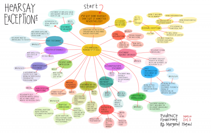
(See http://www.openlawlab.com/2013/03/20/law-flowcharts-hearsay-exceptions/ for original)
I could not agree more, and for years I have made flow charts when looking at an area of the law that is new to me. But it is a laborious process, which is what led me to look for a way to do it more efficiently.
Metaphorical Shoes
Because the laws Congress enacts are often so complex, many of them essentially tell the Executive Branch to figure out how to implement them by writing regulations, which brings us to this abbreviated look at metaphorical “shoes” (click to enlarge):

The chart shows a simplified subset of selected relationships among grammatical variations and contextual uses of a metaphorical phrase “stands in the shoes” vs. “stand in the shoes”. Despite the small formal one letter difference in these terms—a small enough difference to cause many search engines, n-gram extractors, or people to just gloss over it—functionally, they are quite different (see the diagram for details). In this case, the directed graph essentially tells you when “these are not the shoes you are looking for” and where to find the right shoes.
Typically, as Margaret Hagan suggests, you have to do a fair amount careful reading, note-taking, and comparative analysis to sort out small differences like this, but just as the other charts shown here make the complex appear simple, I like to think that this chart makes the difference clear pretty quickly, including quotes and references, so you can double-check everything.
I’m certainly not advocating skipping the important research steps of careful reading, note-taking, and comparative analysis, but if there are tools available to make the process more efficient, even if only by weeding out potential dead ends (as in this case), why not use them?
Survey
That, among other questions, is being examined in this survey about legal research software. If you have 3–5 minutes to spare, please fill out the survey. If you have friends or colleagues who you think might find the survey or its results interesting, please forward the link to them (http://www.surveymonkey.com/s/8VKV3YM) and ask them to fill it out. Ideally, there will be enough responses to publish something in the near future.
As always, comments, questions, etc. are most welcome.
Original content Copyright © 2013 Alex M. Hendler. All Rights Reserved. All other works subject to copyrights as claimed or dedicated by their respective authors or owners.
